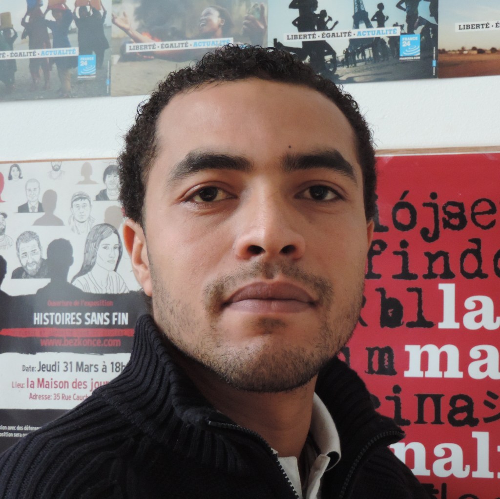
Abdessamad Ait Aicha — Journalist, Trainer, Digital Media Consultant
:root {
–ink: #16181d;
–ink-soft: #3d424d;
–muted: #6b7180;
–paper: #faf8f4;
–card: #ffffff;
–line: #e6e1d7;
–accent: #b3261e; /* أحمر الحبر الصحفي */
–accent-dark: #8c1c16;
–gold: #c08a2e;
–cat-journalism: #b3261e;
–cat-training: #1f6f5c;
–cat-digital: #2b4c9b;
–cat-talks: #8a4fa3;
–cat-freedom: #3a3a3a;
–cat-about: #c08a2e;
–radius: 10px;
–wrap: 1180px;
–font-body: « IBM Plex Sans Arabic », « Noto Naskh Arabic », Tahoma, sans-serif;
–font-head: « Noto Kufi Arabic », « IBM Plex Sans Arabic », Tahoma, sans-serif;
}
* { box-sizing: border-box; }
html { scroll-behavior: smooth; }
body {
margin: 0;
background: var(–paper);
color: var(–ink);
font-family: var(–font-body);
font-size: 17px;
line-height: 1.85;
direction: rtl;
text-align: right;
}
img { max-width: 100%; height: auto; }
a { color: var(–accent); text-decoration: none; }
a:hover { color: var(–accent-dark); text-decoration: underline; }
h1, h2, h3, h4 { font-family: var(–font-head); line-height: 1.45; margin: 0 0 .6em; color: var(–ink); }
.wrap { max-width: var(–wrap); margin: 0 auto; padding: 0 20px; }
.screen-reader-text { position: absolute; width: 1px; height: 1px; overflow: hidden; clip: rect(0 0 0 0); }
/* ———- Header ———- */
.topbar { background: var(–ink); color: #cfd2d8; font-size: 13px; }
.topbar .wrap { display: flex; justify-content: space-between; align-items: center; min-height: 36px; gap: 12px; flex-wrap: wrap; }
.topbar a { color: #fff; }
.topbar .langs span { margin-inline-start: 10px; opacity: .8; }
.site-header { background: var(–card); border-bottom: 3px solid var(–ink); position: sticky; top: 0; z-index: 50; }
.site-header .wrap { display: flex; align-items: center; justify-content: space-between; gap: 20px; min-height: 78px; }
.brand { display: flex; align-items: center; gap: 14px; color: var(–ink); }
.brand:hover { text-decoration: none; color: var(–ink); }
.brand-mark {
width: 48px; height: 48px; border-radius: 50%;
background: var(–accent); color: #fff; display: grid; place-items: center;
font-family: var(–font-head); font-weight: 700; font-size: 20px;
}
.brand-name { font-family: var(–font-head); font-weight: 800; font-size: 21px; line-height: 1.2; }
.brand-tag { display: block; font-size: 12.5px; color: var(–muted); font-weight: 400; font-family: var(–font-body); }
.main-nav ul { list-style: none; margin: 0; padding: 0; display: flex; gap: 4px; flex-wrap: wrap; }
.main-nav li { position: relative; }
.main-nav a { display: block; padding: 8px 12px; color: var(–ink); font-weight: 600; font-size: 15px; border-radius: 6px; }
.main-nav a:hover, .main-nav .current-menu-item > a, .main-nav .current-category-ancestor > a { background: var(–paper); color: var(–accent); text-decoration: none; }
.main-nav .sub-menu { display: none; position: absolute; top: 100%; right: 0; background: var(–card); border: 1px solid var(–line); border-radius: 8px; padding: 6px; min-width: 230px; box-shadow: 0 10px 30px rgba(0,0,0,.08); flex-direction: column; }
.main-nav li:hover > .sub-menu, .main-nav li:focus-within > .sub-menu { display: flex; }
.nav-toggle { display: none; background: none; border: 1px solid var(–line); border-radius: 6px; padding: 8px 12px; font: inherit; cursor: pointer; }
/* ———- Hero ———- */
.hero { background: var(–ink); color: #fff; padding: 64px 0 56px; position: relative; overflow: hidden; }
.hero::after { content: « »; position: absolute; inset: auto -10% -60% auto; width: 520px; height: 520px; border-radius: 50%; background: radial-gradient(circle, rgba(179,38,30,.45), transparent 70%); }
.hero .wrap { position: relative; z-index: 1; display: grid; grid-template-columns: 1.4fr 1fr; gap: 40px; align-items: center; }
.hero h1 { color: #fff; font-size: clamp(30px, 4.4vw, 48px); margin-bottom: .3em; }
.hero .alias { color: #e7b9b5; font-size: 15px; margin-bottom: 18px; }
.hero p.lead { color: #d9dbe0; font-size: 18.5px; max-width: 640px; }
.hero .quote { border-inline-start: 4px solid var(–accent); padding: 16px 20px; background: rgba(255,255,255,.06); border-radius: 0 var(–radius) var(–radius) 0; font-family: var(–font-head); font-size: 18px; }
.hero .quote small { display: block; color: #aeb3bd; font-family: var(–font-body); font-size: 13px; margin-top: 8px; }
.btn { display: inline-block; padding: 11px 22px; border-radius: 999px; font-weight: 700; font-size: 15px; border: 2px solid transparent; }
.btn-primary { background: var(–accent); color: #fff; }
.btn-primary:hover { background: var(–accent-dark); color: #fff; text-decoration: none; }
.btn-ghost { border-color: rgba(255,255,255,.5); color: #fff; }
.btn-ghost:hover { background: #fff; color: var(–ink); text-decoration: none; }
.hero .actions { display: flex; gap: 12px; flex-wrap: wrap; margin-top: 22px; }
/* ———- Sections ———- */
.section { padding: 56px 0; }
.section-head { display: flex; align-items: end; justify-content: space-between; gap: 16px; border-bottom: 2px solid var(–ink); padding-bottom: 10px; margin-bottom: 28px; }
.section-head h2 { margin: 0; font-size: 26px; }
.section-head a { font-weight: 700; font-size: 14px; }
.pillars { display: grid; grid-template-columns: repeat(4, 1fr); gap: 18px; }
.pillar { background: var(–card); border: 1px solid var(–line); border-radius: var(–radius); padding: 22px; border-top: 5px solid var(–c, var(–accent)); display: flex; flex-direction: column; transition: transform .15s, box-shadow .15s; }
.pillar:hover { transform: translateY(-3px); box-shadow: 0 12px 28px rgba(0,0,0,.07); }
.pillar h3 { font-size: 19px; margin-bottom: 8px; }
.pillar p { color: var(–ink-soft); font-size: 15px; flex: 1; margin: 0 0 14px; }
.pillar .count { font-size: 13px; color: var(–muted); }
.pillar .subs { list-style: none; padding: 0; margin: 0 0 12px; font-size: 14px; }
.pillar .subs li::before { content: « ◂ « ; color: var(–c); }
/* ———- Post cards ———- */
.grid { display: grid; grid-template-columns: repeat(3, 1fr); gap: 22px; }
.card { background: var(–card); border: 1px solid var(–line); border-radius: var(–radius); overflow: hidden; display: flex; flex-direction: column; }
.card .thumb { aspect-ratio: 16/9; background: linear-gradient(135deg, #2a2d34, #16181d); display: grid; place-items: center; color: rgba(255,255,255,.25); font-family: var(–font-head); font-size: 34px; }
.card .thumb img { width: 100%; height: 100%; object-fit: cover; }
.card .body { padding: 18px 20px 20px; display: flex; flex-direction: column; flex: 1; }
.card h3 { font-size: 18px; margin-bottom: 8px; }
.card h3 a { color: var(–ink); }
.card h3 a:hover { color: var(–accent); }
.card .excerpt { color: var(–ink-soft); font-size: 15px; flex: 1; }
.meta { font-size: 13px; color: var(–muted); display: flex; gap: 10px; flex-wrap: wrap; align-items: center; }
.cat-badge { display: inline-block; font-size: 12px; font-weight: 700; padding: 2px 10px; border-radius: 999px; background: var(–c, var(–accent)); color: #fff !important; }
.cat-badge:hover { text-decoration: none; opacity: .9; }
.source-chip { font-size: 12.5px; background: var(–paper); border: 1px solid var(–line); padding: 1px 8px; border-radius: 6px; color: var(–ink-soft); }
/* Category colors by slug */
.c-journalism { –c: var(–cat-journalism); }
.c-training, .c-citizen-journalism, .c-media-education { –c: var(–cat-training); }
.c-digital-humanities { –c: var(–cat-digital); }
.c-talks { –c: var(–cat-talks); }
.c-press-freedom { –c: var(–cat-freedom); }
.c-about-me { –c: var(–cat-about); }
/* ———- Blog list ———- */
.layout { display: grid; grid-template-columns: 1fr 320px; gap: 40px; padding: 44px 0 64px; }
.filters { display: flex; flex-wrap: wrap; gap: 8px; margin-bottom: 26px; }
.filters a { padding: 6px 14px; border: 1px solid var(–line); border-radius: 999px; background: var(–card); color: var(–ink); font-size: 14px; font-weight: 600; }
.filters a.is-active, .filters a:hover { background: var(–ink); color: #fff; text-decoration: none; border-color: var(–ink); }
.list-item { display: grid; grid-template-columns: 110px 1fr; gap: 20px; padding: 22px 0; border-bottom: 1px solid var(–line); }
.list-item .date { font-family: var(–font-head); color: var(–muted); text-align: center; border-inline-end: 3px solid var(–c, var(–line)); padding-inline-end: 14px; }
.list-item .date .y { display: block; font-size: 24px; font-weight: 800; color: var(–ink); line-height: 1.2; }
.list-item .date .dm { font-size: 13px; }
.list-item h2 { font-size: 21px; margin-bottom: 6px; }
.list-item h2 a { color: var(–ink); }
.list-item p { margin: 6px 0 0; color: var(–ink-soft); font-size: 15.5px; }
.year-divider { font-family: var(–font-head); font-size: 15px; color: var(–accent); font-weight: 800; margin: 30px 0 0; letter-spacing: .5px; }
.archive-head { background: var(–ink); color: #fff; padding: 44px 0 36px; border-bottom: 5px solid var(–c, var(–accent)); }
.archive-head h1 { color: #fff; font-size: clamp(26px, 3.6vw, 38px); margin: 0 0 8px; }
.archive-head p { color: #cfd2d8; margin: 0; max-width: 760px; }
.archive-head .kicker { color: #e7b9b5; font-size: 13px; font-weight: 700; letter-spacing: .5px; }
/* ———- Sidebar ———- */
.sidebar .widget { background: var(–card); border: 1px solid var(–line); border-radius: var(–radius); padding: 20px; margin-bottom: 22px; }
.sidebar .widget h3, .sidebar .widget-title { font-size: 16px; border-bottom: 2px solid var(–ink); padding-bottom: 8px; margin-bottom: 12px; }
.sidebar ul { list-style: none; padding: 0; margin: 0; }
.sidebar li { padding: 6px 0; border-bottom: 1px dashed var(–line); font-size: 15px; }
.sidebar li:last-child { border-bottom: 0; }
.sidebar .children { padding-inline-start: 14px; }
.about-mini img { border-radius: 50%; width: 84px; height: 84px; object-fit: cover; }
/* ———- Single ———- */
.article { background: var(–card); border: 1px solid var(–line); border-radius: var(–radius); padding: 36px 40px; }
.article h1 { font-size: clamp(25px, 3.2vw, 36px); margin-bottom: 12px; }
.article .entry { font-size: 18px; }
.article .entry p { margin: 0 0 1.1em; }
.article .entry blockquote { border-inline-start: 4px solid var(–accent); margin: 1.4em 0; padding: 6px 20px; color: var(–ink-soft); background: var(–paper); }
.article .entry iframe { max-width: 100%; }
.source-box { margin-top: 28px; padding: 18px 20px; background: var(–paper); border: 1px solid var(–line); border-inline-start: 5px solid var(–accent); border-radius: 8px; display: flex; justify-content: space-between; align-items: center; gap: 16px; flex-wrap: wrap; }
.source-box strong { font-family: var(–font-head); }
.post-nav { display: flex; justify-content: space-between; gap: 16px; margin-top: 26px; font-size: 15px; }
.tags a { display: inline-block; font-size: 13px; background: var(–paper); border: 1px solid var(–line); padding: 2px 10px; border-radius: 999px; margin: 0 0 6px 6px; color: var(–ink-soft); }
/* ———- Timeline (press freedom) ———- */
.timeline { position: relative; padding-inline-start: 26px; border-inline-start: 3px solid var(–ink); }
.timeline .t-item { position: relative; padding: 0 0 24px; }
.timeline .t-item::before { content: « »; position: absolute; right: -35px; top: 8px; width: 15px; height: 15px; border-radius: 50%; background: var(–accent); border: 3px solid var(–paper); }
.timeline .t-date { font-family: var(–font-head); font-weight: 800; color: var(–accent); font-size: 14px; }
.timeline .t-item h3 { font-size: 17px; margin: 2px 0 0; }
.timeline .t-item h3 a { color: var(–ink); }
.band { background: #efe9df; }
.split { display: grid; grid-template-columns: 1fr 1.3fr; gap: 44px; align-items: start; }
@media (max-width: 1020px) { .split { grid-template-columns: 1fr; } }
/* ———- Pagination ———- */
.pagination { display: flex; gap: 6px; flex-wrap: wrap; margin-top: 30px; }
.pagination .page-numbers { padding: 6px 13px; border: 1px solid var(–line); border-radius: 6px; background: var(–card); color: var(–ink); }
.pagination .current { background: var(–ink); color: #fff; border-color: var(–ink); }
/* ———- Footer ———- */
.site-footer { background: var(–ink); color: #b9bdc6; padding: 46px 0 22px; font-size: 15px; }
.site-footer a { color: #fff; }
.footer-cols { display: grid; grid-template-columns: 1.4fr 1fr 1fr; gap: 30px; }
.site-footer h4 { color: #fff; font-size: 16px; }
.site-footer ul { list-style: none; padding: 0; margin: 0; }
.site-footer li { padding: 3px 0; }
.copy { border-top: 1px solid #2f333c; margin-top: 30px; padding-top: 16px; font-size: 13px; display: flex; justify-content: space-between; gap: 10px; flex-wrap: wrap; }
/* ———- Search form ———- */
.search-form { display: flex; gap: 6px; }
.search-form input[type= »search »] { flex: 1; padding: 9px 12px; border: 1px solid var(–line); border-radius: 6px; font: inherit; font-size: 15px; }
.search-form button { padding: 9px 14px; border: 0; border-radius: 6px; background: var(–ink); color: #fff; font: inherit; font-size: 14px; cursor: pointer; }
/* ———- Responsive ———- */
@media (max-width: 1020px) {
.pillars { grid-template-columns: repeat(2, 1fr); }
.grid { grid-template-columns: repeat(2, 1fr); }
.layout { grid-template-columns: 1fr; }
.hero .wrap { grid-template-columns: 1fr; }
}
@media (max-width: 760px) {
body { font-size: 16px; }
.nav-toggle { display: block; }
.main-nav { display: none; position: absolute; top: 100%; right: 0; left: 0; background: var(–card); border-bottom: 2px solid var(–ink); padding: 10px 16px; }
.main-nav.is-open { display: block; }
.main-nav ul { flex-direction: column; }
.main-nav .sub-menu { display: flex; position: static; box-shadow: none; border: 0; padding-inline-start: 14px; }
.pillars, .grid, .footer-cols { grid-template-columns: 1fr; }
.article { padding: 24px 20px; }
.list-item { grid-template-columns: 76px 1fr; gap: 14px; }
.list-item .date .y { font-size: 19px; }
.section { padding: 40px 0; }
}
/* ===================== v2: open, Saharan-indigo identity ===================== */
:root {
–ink: #1C2154;
–ink-soft: #4A4F78;
–muted: #7A7FA0;
–paper: #F5F6FA;
–card: #FFFFFF;
–line: #DCDFEC;
–accent: #3448C5;
–accent-dark: #22328F;
–cat-journalism: #3448C5;
–cat-training: #17806F;
–cat-digital: #6E46D6;
–cat-talks: #D98E04;
–cat-freedom: #C93349;
–cat-about: #4A4F78;
–font-body: « Readex Pro », Tahoma, sans-serif;
–font-head: « Reem Kufi », « Readex Pro », Tahoma, sans-serif;
}
body { font-weight: 300; line-height: 1.9; }
strong, b { font-weight: 500; }
h1, h2, h3, h4 { font-weight: 600; }
:focus-visible { outline: 3px solid var(–cat-talks); outline-offset: 3px; border-radius: 3px; }
/* header: quiet, no heavy rule */
.site-header { background: rgba(245,246,250,.92); backdrop-filter: blur(8px); border-bottom: 1px solid var(–line); }
.site-header .wrap { min-height: 68px; }
.brand-mark { background: var(–ink); width: 40px; height: 40px; font-size: 18px; border-radius: 12px; }
.brand-name { font-size: 18px; font-weight: 600; }
.brand-tag { font-family: var(–font-body); letter-spacing: .2px; }
.main-nav a { font-weight: 400; font-size: 14.5px; color: var(–ink-soft); }
.main-nav a:hover { background: transparent; color: var(–ink); text-decoration: underline; text-underline-offset: 6px; }
.main-nav .sub-menu { border-radius: 14px; box-shadow: 0 18px 40px rgba(28,33,84,.12); }
/* inner pages: light headers instead of black slabs */
.archive-head { background: transparent; color: var(–ink); border-bottom: 1px solid var(–line); padding: 56px 0 30px; }
.archive-head h1 { color: var(–ink); font-size: clamp(34px, 5vw, 60px); }
.archive-head h1::after { content: « »; display: block; width: 72px; height: 6px; border-radius: 3px; background: var(–c, var(–accent)); margin-top: 14px; }
.archive-head p { color: var(–ink-soft); }
.archive-head .kicker { display: none; }
.article, .sidebar .widget { border-radius: 18px; border-color: var(–line); }
.sidebar .widget h3, .sidebar .widget-title { border-bottom: 0; color: var(–muted); font-size: 14px; font-weight: 500; }
.cat-badge { font-weight: 500; }
.btn { font-weight: 500; }
.btn-primary { background: var(–ink); }
.btn-primary:hover { background: var(–accent); }
.source-box { border-inline-start-color: var(–c, var(–accent)); border-radius: 14px; }
.list-item .date .y { font-weight: 600; }
.year-divider { color: var(–muted); font-weight: 600; font-size: 28px; }
.filters a { font-weight: 400; }
.site-footer { background: var(–paper); color: var(–ink-soft); border-top: 1px solid var(–line); }
.site-footer a, .site-footer h4 { color: var(–ink); }
.copy { border-top-color: var(–line); }
/* —————- HOME —————- */
.home main { overflow-x: clip; }
.intro { padding: clamp(40px, 7vw, 96px) 0 26px; }
.giant {
font-family: var(–font-head); font-weight: 700; color: var(–ink);
font-size: clamp(64px, 13.5vw, 196px); line-height: .98; letter-spacing: -1px;
margin: 0 0 28px;
}
.intro-row { display: grid; grid-template-columns: minmax(0, 34em) minmax(260px, 380px); justify-content: space-between; gap: 32px; align-items: end; }
.intro-lead { font-size: clamp(18px, 1.7vw, 22px); color: var(–ink-soft); margin: 0; line-height: 1.8; }
.intro-search label { display: block; font-size: 14px; color: var(–muted); margin-bottom: 6px; }
.intro-search div { display: flex; border: 1.5px solid var(–ink); border-radius: 999px; overflow: hidden; background: var(–card); }
.intro-search input { flex: 1; border: 0; padding: 12px 18px; font: inherit; font-size: 15px; background: transparent; color: var(–ink); min-width: 0; }
.intro-search input:focus { outline: none; }
.intro-search div:focus-within { box-shadow: 0 0 0 3px rgba(217,142,4,.45); }
.intro-search button { border: 0; background: var(–ink); color: #fff; font: inherit; font-size: 14px; padding: 0 22px; cursor: pointer; }
/* the river of headlines: the one moving thing */
.river { padding: 34px 0 10px; border-top: 1px solid var(–line); border-bottom: 1px solid var(–line); margin-top: 38px; }
.river-row { overflow: hidden; padding: 7px 0; mask-image: linear-gradient(to left, transparent, #000 6%, #000 94%, transparent); -webkit-mask-image: linear-gradient(to left, transparent, #000 6%, #000 94%, transparent); }
.river-track { display: flex; width: max-content; gap: 0; animation: drift 190s linear infinite; }
.river-row:nth-child(2) .river-track { animation-duration: 230s; animation-direction: reverse; }
.river-row:nth-child(3) .river-track { animation-duration: 210s; }
.river:hover .river-track, .river:focus-within .river-track { animation-play-state: paused; }
.river-copy { display: flex; }
@keyframes drift { from { transform: translateX(0); } to { transform: translateX(50%); } }
.hl {
display: inline-flex; align-items: baseline; gap: 10px; white-space: nowrap;
font-family: var(–font-head); font-weight: 500; font-size: clamp(19px, 2vw, 27px);
color: var(–ink); padding: 4px 22px; position: relative;
}
.hl::before { content: « »; width: 9px; height: 9px; border-radius: 50%; background: var(–c); flex: none; transform: translateY(-3px); }
.hl-y { font-family: var(–font-body); font-size: 13px; color: var(–muted); font-weight: 400; }
.hl:hover, .hl:focus-visible { color: var(–c); text-decoration: none; }
.river-note { font-size: 13.5px; color: var(–muted); margin-top: 18px; margin-bottom: 0; }
/* domains as large typographic rows */
.domains { padding-top: clamp(56px, 8vw, 110px); padding-bottom: 40px; }
.domain-list { list-style: none; margin: 0; padding: 0; }
.domain {
display: grid; grid-template-columns: minmax(0, 1.3fr) minmax(0, 1fr) auto; gap: 28px; align-items: baseline;
padding: 26px 0; border-top: 1px solid var(–line);
}
.domain:last-child { border-bottom: 1px solid var(–line); }
.d-name {
font-family: var(–font-head); font-weight: 600; color: var(–ink);
font-size: clamp(30px, 4.6vw, 62px); line-height: 1.15;
background: linear-gradient(var(–c), var(–c)) no-repeat right bottom / 0 5px;
transition: background-size .35s ease, color .2s;
padding-bottom: 4px;
}
.domain:hover .d-name, .d-name:focus-visible { color: var(–c); background-size: 100% 5px; text-decoration: none; }
.d-desc { margin: 0; color: var(–ink-soft); font-size: 16px; max-width: 30em; }
.d-sub { display: block; margin-top: 6px; font-size: 15px; }
.d-sub a { color: var(–c); font-weight: 400; }
.d-count { font-family: var(–font-head); font-size: clamp(30px, 3.4vw, 46px); color: var(–c); font-weight: 600; min-width: 2ch; text-align: left; }
/* the case: deep indigo band, statement + year stations */
.case { background: var(–ink); color: #E7E9F6; padding: clamp(56px, 8vw, 104px) 0; margin-top: 60px; }
.case-statement {
font-family: var(–font-head); font-weight: 600; color: #fff;
font-size: clamp(28px, 4.2vw, 56px); line-height: 1.35; max-width: 17em; margin: 0 0 54px;
}
.stations { list-style: none; margin: 0 0 40px; padding: 26px 0 0; display: grid; grid-template-columns: repeat(7, minmax(150px, 1fr)); gap: 0; border-top: 2px solid rgba(255,255,255,.25); overflow-x: auto; }
.station { position: relative; padding: 0 0 0 20px; }
.station::before { content: « »; position: absolute; top: -34px; right: 0; width: 14px; height: 14px; border-radius: 50%; background: var(–ink); border: 3px solid var(–cat-freedom); }
.station a { color: inherit; display: block; }
.station a:hover { text-decoration: none; }
.station a:hover .st-t { color: #fff; text-decoration: underline; text-underline-offset: 4px; }
.st-y { display: block; font-family: var(–font-head); font-size: 30px; color: #fff; font-weight: 600; line-height: 1.2; margin-bottom: 6px; }
.st-t { font-size: 14.5px; line-height: 1.7; color: #C8CCE6; }
.case-link { display: inline-block; color: #fff; font-weight: 500; border-bottom: 2px solid var(–cat-freedom); padding-bottom: 3px; }
.case-link:hover { text-decoration: none; color: #fff; border-bottom-color: #fff; }
.case-link.dark { color: var(–ink); border-bottom-color: var(–accent); }
.case-link.dark:hover { color: var(–accent); }
/* latest: a quiet list */
.latest { padding-top: clamp(56px, 8vw, 100px); padding-bottom: clamp(56px, 8vw, 100px); }
.latest h2 { font-size: 22px; color: var(–muted); font-weight: 500; margin-bottom: 18px; }
.latest-list { list-style: none; margin: 0 0 30px; padding: 0; columns: 2; column-gap: 56px; }
.latest-list li { break-inside: avoid; border-top: 1px solid var(–line); }
.latest-list a { display: block; padding: 16px 0 18px; color: var(–ink); }
.latest-list a:hover { text-decoration: none; }
.latest-list a:hover .l-title { color: var(–c); }
.l-title { display: block; font-family: var(–font-head); font-size: 21px; font-weight: 500; line-height: 1.5; }
.l-title::before { content: « »; display: inline-block; width: 8px; height: 8px; border-radius: 50%; background: var(–c); margin-inline-end: 10px; transform: translateY(-3px); }
.l-meta { font-size: 13.5px; color: var(–muted); }
@media (max-width: 1020px) {
.stations { grid-template-columns: repeat(7, 190px); padding-bottom: 10px; }
}
@media (max-width: 760px) {
.intro-row { grid-template-columns: 1fr; }
.domain { grid-template-columns: 1fr auto; gap: 6px 16px; }
.d-desc { grid-column: 1 / -1; grid-row: 2; }
.d-count { grid-row: 1; grid-column: 2; }
.latest-list { columns: 1; }
.main-nav { background: var(–paper); }
}
@media (prefers-reduced-motion: reduce) {
.river-track { animation: none; }
.river-row { overflow-x: auto; }
.river-copy { display: none; }
.d-name { transition: none; }
}
.brand-name { white-space: nowrap; }
.main-nav ul { flex-wrap: nowrap; }
@media (max-width: 1180px) and (min-width: 761px) { .main-nav a { padding: 8px 8px; font-size: 13.5px; } }
/* ===================== v3: Lalezar, full-bleed flowing blocks ===================== */
:root {
–font-head: « Lalezar », « Readex Pro », Tahoma, sans-serif;
–cat-video: #C2410C;
–deep: #161B47;
}
.c-video { –c: var(–cat-video); }
h1, h2, h3, h4, .brand-name, .giant, .d-name { font-weight: 400; letter-spacing: 0; }
.archive-head h1, .article h1 { font-weight: 400; }
.list-item h2, .card h3 { font-weight: 400; }
.brand-name { font-size: 22px; }
.site-header { background: rgba(245,246,250,.86); }
/* ——– Block 1: hero with portrait + contact card ——– */
.hero3 {
position: relative;
background:
radial-gradient(1100px 520px at 85% -10%, rgba(52,72,197,.13), transparent 60%),
radial-gradient(700px 420px at 8% 55%, rgba(217,142,4,.09), transparent 65%),
var(–paper);
padding: clamp(48px, 7vw, 104px) 0 clamp(70px, 9vw, 130px);
}
.hero3-grid { display: grid; grid-template-columns: minmax(0, 1.15fr) minmax(320px, .85fr); gap: clamp(32px, 6vw, 90px); align-items: center; }
.portrait {
position: relative; width: clamp(120px, 14vw, 176px); aspect-ratio: 1; margin: 0 0 26px;
border-radius: 50%; overflow: hidden; background: var(–ink);
box-shadow: 0 0 0 6px var(–paper), 0 0 0 7px var(–line);
}
.portrait img { width: 100%; height: 100%; object-fit: cover; position: relative; z-index: 1; }
.portrait-mono { position: absolute; inset: 0; display: grid; place-items: center; color: #fff; font-family: var(–font-head); font-size: 64px; }
.name { font-family: var(–font-head); font-size: clamp(54px, 8.4vw, 124px); line-height: 1.05; color: var(–ink); margin: 0; }
.name-lat { font-size: clamp(15px, 1.3vw, 18px); letter-spacing: 3px; color: var(–muted); margin: 10px 0 22px; text-align: right; }
.who-lead { font-size: clamp(18px, 1.6vw, 21px); color: var(–ink-soft); max-width: 30em; margin: 0; }
/* the card: credit-card proportions, deep indigo, bilingual */
.card-wrap { perspective: 1200px; }
.pcard {
position: relative; aspect-ratio: 1.586; width: 100%; max-width: 470px; margin-inline-start: auto;
border-radius: 22px; padding: clamp(20px, 2.4vw, 30px);
color: #fff; display: flex; flex-direction: column; justify-content: space-between;
background:
radial-gradient(120% 140% at 100% 0%, #3448C5 0%, transparent 55%),
radial-gradient(90% 120% at 0% 100%, #6E46D6 0%, transparent 55%),
var(–deep);
box-shadow: 0 30px 60px -20px rgba(22,27,71,.55), inset 0 1px 0 rgba(255,255,255,.18);
overflow: hidden; transition: transform .5s cubic-bezier(.2,.7,.2,1);
}
.pcard::after { /* fine guilloche lines */
content: « »; position: absolute; inset: 0; pointer-events: none; opacity: .16;
background: repeating-radial-gradient(circle at 15% 120%, transparent 0 14px, rgba(255,255,255,.55) 14px 15px);
}
.card-wrap:hover .pcard { transform: rotateY(-6deg) rotateX(4deg); }
.pcard-top { display: flex; justify-content: space-between; align-items: center; position: relative; z-index: 1; }
.pcard-chip { width: 50px; height: 38px; border-radius: 8px; background: linear-gradient(135deg, #F6D58A, #C9952B); box-shadow: inset 0 0 0 1px rgba(0,0,0,.15); position: relative; }
.pcard-chip::before { content: « »; position: absolute; inset: 9px 0; border-top: 1px solid rgba(0,0,0,.25); border-bottom: 1px solid rgba(0,0,0,.25); }
.pcard-brand { font-size: 12px; letter-spacing: 3px; opacity: .8; direction: ltr; }
.pcard-mail { position: relative; z-index: 1; color: #fff; font-size: clamp(17px, 2vw, 24px); letter-spacing: 1.5px; text-align: left; font-weight: 400; word-break: break-all; }
.pcard-mail:hover { color: #F6D58A; text-decoration: none; }
.pcard-bottom { position: relative; z-index: 1; display: flex; justify-content: space-between; align-items: end; gap: 12px; }
.pcard-name { display: block; font-family: var(–font-head); font-size: clamp(17px, 1.7vw, 21px); line-height: 1.3; }
.pcard-en .pcard-name { font-family: var(–font-body); font-weight: 500; font-size: clamp(11px, 1.05vw, 13px); letter-spacing: 1.6px; }
.pcard-role { display: block; font-size: 12px; opacity: .78; }
.pcard-en { text-align: left; }
.card-actions { display: flex; gap: 10px; align-items: center; justify-content: flex-end; margin-top: 22px; flex-wrap: wrap; max-width: 470px; margin-inline-start: auto; }
.pill { font: inherit; font-size: 15px; font-weight: 400; padding: 10px 22px; border-radius: 999px; border: 1.5px solid var(–ink); background: transparent; color: var(–ink); cursor: pointer; }
.pill:hover { background: var(–ink); color: #fff; text-decoration: none; }
.pill-dark { background: var(–ink); color: #fff; }
.pill-dark:hover { background: var(–accent); border-color: var(–accent); color: #fff; }
.copy-msg { font-size: 14px; color: var(–cat-training); }
/* ——– Block 2: three services ——– */
.services { background: linear-gradient(to bottom, var(–paper), #fff 140px); padding: clamp(56px, 8vw, 110px) 0 clamp(56px, 7vw, 90px); }
.svc-grid { display: grid; grid-template-columns: repeat(3, 1fr); gap: 0; }
.svc { padding: 8px clamp(20px, 3vw, 44px) 10px; border-inline-start: 1px solid var(–line); display: flex; flex-direction: column; }
.svc:first-child { border-inline-start: 0; padding-inline-start: 0; }
.svc:last-child { padding-inline-end: 0; }
.svc h3 { font-size: clamp(36px, 4vw, 54px); color: var(–ink); margin: 0 0 14px; line-height: 1.15; position: relative; }
.svc h3::after { content: « »; display: block; width: 46px; height: 5px; border-radius: 3px; background: var(–c); margin-top: 12px; transition: width .4s ease; }
.svc:hover h3::after { width: 100%; }
.svc p { color: var(–ink-soft); font-size: 16.5px; margin: 0 0 16px; }
.svc ul { list-style: none; padding: 0; margin: 0 0 22px; flex: 1; }
.svc li { padding: 7px 0; font-size: 15.5px; color: var(–ink); border-bottom: 1px dashed var(–line); }
.svc li::before { content: « »; display: inline-block; width: 7px; height: 7px; border-radius: 50%; background: var(–c); margin-inline-end: 10px; transform: translateY(-2px); }
.svc-link { align-self: flex-start; font-weight: 500; color: var(–c); border-bottom: 2px solid currentColor; padding-bottom: 2px; }
.svc-link:hover { text-decoration: none; color: var(–ink); }
.clients { margin-top: clamp(56px, 7vw, 90px); padding-top: 34px; border-top: 1px solid var(–line); text-align: center; }
.clients h2 { font-family: var(–font-body); font-size: 15px; color: var(–muted); font-weight: 400; margin-bottom: 22px; }
.clients ul { list-style: none; margin: 0; padding: 0; display: flex; flex-wrap: wrap; justify-content: center; gap: 14px clamp(28px, 5vw, 68px); direction: ltr; }
.clients li { font-family: « Readex Pro », sans-serif; font-weight: 600; font-size: clamp(18px, 2vw, 26px); color: var(–ink); opacity: .78; letter-spacing: .3px; }
/* ——– Block 3: river (smooth from white) ——– */
.river3 { margin-top: 0; border: 0; background: linear-gradient(to bottom, #fff, var(–paper) 120px); padding: 40px 0 70px; }
.river-h { font-size: clamp(30px, 3.4vw, 44px); color: var(–ink); margin-bottom: 16px; }
.hl { font-family: var(–font-body); font-weight: 400; }
/* ——– Dark band: video + case flow as one continuous surface ——– */
.band-dark { background: var(–deep); color: #E7E9F6; position: relative; }
.vid { padding: clamp(70px, 9vw, 120px) 0 clamp(40px, 5vw, 60px); margin-top: 0; }
.vid::before { /* soft seam from the light river into the dark band */
content: « »; position: absolute; left: 0; right: 0; top: -90px; height: 90px; pointer-events: none;
background: linear-gradient(to bottom, rgba(22,27,71,0), var(–deep));
}
.vid-grid { display: grid; grid-template-columns: minmax(0, .8fr) minmax(0, 1.2fr); gap: clamp(28px, 5vw, 70px); align-items: center; }
.vid-text h2 { color: #fff; font-size: clamp(40px, 5vw, 66px); margin: 0 0 8px; }
.vid-title { font-size: 20px; color: #fff; font-weight: 500; margin: 0 0 10px; }
.vid-text p { color: #C8CCE6; }
.vid-frame { position: relative; aspect-ratio: 16/9; border-radius: 18px; overflow: hidden; background: #000; box-shadow: 0 30px 60px -25px rgba(0,0,0,.6); }
.vid-frame iframe { position: absolute; inset: 0; width: 100%; height: 100%; border: 0; }
.vid-play { all: unset; cursor: pointer; position: absolute; inset: 0; display: block; }
.vid-play img { width: 100%; height: 100%; object-fit: cover; opacity: .85; transition: opacity .3s; }
.vid-play:hover img, .vid-play:focus-visible img { opacity: 1; }
.vid-play:focus-visible { outline: 3px solid var(–cat-talks); outline-offset: -3px; }
.vid-btn { position: absolute; top: 50%; left: 50%; width: 78px; height: 78px; margin: -39px 0 0 -39px; border-radius: 50%; background: rgba(255,255,255,.95); box-shadow: 0 10px 30px rgba(0,0,0,.35); }
.vid-btn::after { content: « »; position: absolute; top: 50%; left: 50%; margin: -13px 0 0 -7px; border-style: solid; border-width: 13px 0 13px 22px; border-color: transparent transparent transparent var(–deep); }
.case.band-dark { background: var(–deep); margin-top: 0; padding-top: clamp(50px, 6vw, 80px); }
.station::before { background: var(–deep); }
.case::after { /* seam back into light */
content: « »; position: absolute; left: 0; right: 0; bottom: -90px; height: 90px; pointer-events: none;
background: linear-gradient(to top, rgba(22,27,71,0), var(–deep));
}
.latest { padding-top: clamp(120px, 12vw, 170px); }
.latest h2 { font-family: var(–font-head); font-size: clamp(30px, 3.4vw, 44px); color: var(–ink); }
.l-title { font-family: var(–font-body); font-weight: 400; }
@media (max-width: 1020px) {
.hero3-grid, .vid-grid { grid-template-columns: 1fr; }
.pcard, .card-actions { margin-inline-start: 0; }
.card-actions { justify-content: flex-start; }
.svc-grid { grid-template-columns: 1fr; gap: 44px; }
.svc, .svc:first-child, .svc:last-child { border: 0; padding: 0; }
}
@media (prefers-reduced-motion: reduce) {
.pcard, .svc h3::after { transition: none; }
.card-wrap:hover .pcard { transform: none; }
}
/* ===================== v4 ===================== */
.c-channel { –c: #D98E04; }
.c-events { –c: #0E7490; }
.c-rights-file { –c: #C93349; }
/* professional card */
.bcard {
position: relative; display: grid; grid-template-columns: 1fr 92px; width: 100%; max-width: 500px; margin-inline-start: auto;
aspect-ratio: 1.7; background: #FFFFFF; border-radius: 16px; overflow: hidden;
box-shadow: 0 1px 0 rgba(28,33,84,.06), 0 28px 50px -22px rgba(28,33,84,.35);
border: 1px solid var(–line);
transition: transform .45s cubic-bezier(.2,.7,.2,1);
}
.card-wrap:hover .bcard { transform: rotate(-1.2deg) translateY(-4px); }
.bcard-band { grid-column: 2; grid-row: 1; background: var(–deep); display: grid; place-items: center; position: relative; order: -1; }
.bcard-band::after { content: « »; position: absolute; inset: 0; background: repeating-linear-gradient(135deg, transparent 0 10px, rgba(255,255,255,.05) 10px 11px); }
.bcard-band span { position: relative; z-index: 1; color: #F6D58A; font-family: var(–font-head); font-size: 46px; }
.bcard-body { grid-column: 1; grid-row: 1; padding: clamp(18px, 2.4vw, 28px); display: flex; flex-direction: column; justify-content: space-between; min-width: 0; }
.bcard-ar { display: block; font-family: var(–font-head); font-size: clamp(24px, 2.6vw, 32px); color: var(–ink); line-height: 1.2; }
.bcard-en { display: block; font-size: 12.5px; letter-spacing: 2.4px; color: var(–muted); text-align: right; margin-top: 4px; }
.bcard-roles { border-top: 2px solid var(–cat-talks); padding-top: 10px; font-size: 13px; color: var(–ink-soft); line-height: 1.6; }
.bcard-roles span { display: block; }
.bcard-roles span[lang= »en »] { font-size: 11.5px; color: var(–muted); text-align: right; }
.bcard-contact { list-style: none; margin: 0; padding: 0; font-size: 13.5px; }
.bcard-contact li { display: flex; gap: 10px; align-items: baseline; padding: 1px 0; }
.bc-k { color: var(–muted); font-size: 11.5px; min-width: 3.4em; }
.bcard-contact a { color: var(–ink); font-weight: 500; }
.bcard-contact a:hover { color: var(–accent); }
/* participations strip */
.events-strip { background: linear-gradient(to bottom, var(–paper), #EAF3F5 50%, var(–paper)); padding: clamp(120px, 12vw, 160px) 0 clamp(50px, 6vw, 80px); }
.ev-head { display: flex; justify-content: space-between; align-items: baseline; gap: 16px; margin-bottom: 22px; flex-wrap: wrap; }
.ev-head h2 { font-size: clamp(30px, 3.4vw, 44px); margin: 0; }
.ev-list { list-style: none; margin: 0; padding: 0; display: grid; grid-template-columns: repeat(auto-fill, minmax(260px, 1fr)); gap: 0 32px; }
.ev-list li { border-top: 3px solid var(–cat-events, #0E7490); }
.ev-list a { display: block; padding: 14px 0 20px; color: var(–ink); }
.ev-list a:hover { text-decoration: none; color: #0E7490; }
.ev-date { display: block; font-size: 13.5px; color: var(–muted); }
.ev-title { display: block; font-size: 17px; font-weight: 400; line-height: 1.6; }
.events-strip + .latest { padding-top: clamp(40px, 5vw, 70px); }
/* ———- rights dossier ———- */
.dossier-hero { padding: clamp(70px, 9vw, 130px) 0 clamp(60px, 8vw, 110px); }
.dossier-hero h1 { color: #fff; font-family: var(–font-head); font-size: clamp(56px, 9vw, 130px); line-height: 1; margin: 0 0 24px; }
.dossier-hero h1::after { content: « »; display: block; width: 90px; height: 7px; border-radius: 4px; background: var(–cat-freedom); margin-top: 20px; }
.dossier-lead { font-size: clamp(19px, 2vw, 26px); color: #DDE0F2; max-width: 34em; margin: 0; line-height: 1.75; }
.dossier { display: grid; grid-template-columns: minmax(0, 1fr) 280px; gap: clamp(36px, 6vw, 90px); padding-top: clamp(50px, 7vw, 90px); padding-bottom: clamp(50px, 7vw, 90px); align-items: start; }
.story { grid-column: 1; grid-row: 1; max-width: 40em; }
.story h2, .keydates h2 { font-size: clamp(28px, 3vw, 40px); margin-bottom: 18px; }
.story p { font-size: clamp(17.5px, 1.4vw, 19.5px); line-height: 2.05; color: var(–ink); margin: 0 0 1.15em; }
.story p:first-of-type { font-size: clamp(22px, 2.2vw, 28px); line-height: 1.7; font-family: var(–font-head); color: var(–ink); }
.story p:last-of-type { border-inline-start: 4px solid var(–cat-freedom); padding-inline-start: 18px; font-weight: 500; }
.keydates { grid-column: 2; grid-row: 1; position: sticky; top: 96px; background: #fff; border: 1px solid var(–line); border-radius: 18px; padding: 24px; }
.keydates h2 { font-size: 24px; }
.keydates ol { list-style: none; margin: 0; padding: 0 18px 0 0; border-inline-start: 2px solid var(–line); }
.keydates li { position: relative; padding: 0 0 14px; }
.keydates li::before { content: « »; position: absolute; right: -25px; top: 9px; width: 10px; height: 10px; border-radius: 50%; background: var(–cat-freedom); }
.kd-d { display: block; font-size: 13px; color: var(–cat-freedom); font-weight: 500; }
.kd-t { display: block; font-size: 15px; color: var(–ink); }
.voices { background: #fff; border-top: 1px solid var(–line); padding: clamp(50px, 7vw, 90px) 0; }
.voices-grid { display: grid; grid-template-columns: 1fr 1fr; gap: clamp(30px, 5vw, 70px); }
.voices h2 { font-size: clamp(26px, 2.8vw, 36px); margin-bottom: 14px; }
.voice-list { list-style: none; margin: 0; padding: 0; }
.voice-list li { border-top: 1px solid var(–line); }
.voice-list a { display: grid; grid-template-columns: 1fr auto; gap: 2px 14px; padding: 14px 0; color: var(–ink); }
.voice-list a:hover { text-decoration: none; }
.voice-list a:hover .v-title { color: var(–cat-freedom); }
.v-src { font-family: var(–font-head); font-size: 19px; color: var(–cat-freedom); }
.v-date { grid-row: 1; grid-column: 2; font-size: 13px; color: var(–muted); align-self: center; }
.v-title { grid-column: 1 / -1; font-size: 15.5px; line-height: 1.7; color: var(–ink-soft); }
/* ———- album ———- */
.album { padding-top: 40px; padding-bottom: 80px; }
.album-ev { margin-bottom: 56px; }
.album-ev h2 { font-size: clamp(26px, 2.8vw, 36px); margin-bottom: 0; }
.album-place { color: var(–muted); margin: 0 0 16px; }
.album-grid { display: grid; grid-template-columns: repeat(auto-fill, minmax(220px, 1fr)); gap: 10px; }
.album-item { all: unset; cursor: zoom-in; display: block; aspect-ratio: 4/3; border-radius: 12px; overflow: hidden; background: var(–line); }
.album-item img { width: 100%; height: 100%; object-fit: cover; transition: transform .4s; }
.album-item:hover img { transform: scale(1.04); }
.album-item:focus-visible { outline: 3px solid var(–cat-talks); outline-offset: 2px; }
.album-empty { color: var(–muted); font-size: 18px; }
.lightbox { position: fixed; inset: 0; background: rgba(12,15,40,.92); z-index: 100; display: grid; place-items: center; padding: 20px; }
.lightbox[hidden] { display: none; }
.lightbox figure { margin: 0; max-width: min(1100px, 100%); }
.lightbox img { max-width: 100%; max-height: 80vh; display: block; margin: 0 auto; border-radius: 8px; }
.lightbox figcaption { color: #E7E9F6; text-align: center; margin-top: 12px; }
.lb-close { position: absolute; top: 16px; left: 20px; background: none; border: 0; color: #fff; font-size: 40px; cursor: pointer; line-height: 1; }
@media (max-width: 1020px) {
.dossier { grid-template-columns: 1fr; }
.keydates { position: static; grid-column: 1; grid-row: 1; }
.story { grid-row: 2; }
.voices-grid { grid-template-columns: 1fr; }
.bcard { margin-inline-start: 0; }
}
@media (max-width: 480px) {
.bcard { aspect-ratio: auto; grid-template-columns: 1fr 64px; }
.bcard-body { gap: 14px; }
.bcard-band span { font-size: 34px; }
}
@media (prefers-reduced-motion: reduce) { .bcard { transition: none; } .card-wrap:hover .bcard { transform: none; } }
/* ===================== v5: CV, about, outlets ===================== */
.cv { background: #fff; border-top: 1px solid var(–line); border-bottom: 1px solid var(–line); padding: clamp(60px, 8vw, 110px) 0; }
.cv-grid { display: grid; grid-template-columns: minmax(0, 1.5fr) minmax(280px, 1fr); gap: clamp(36px, 6vw, 90px); align-items: start; }
.cv-main h2 { font-size: clamp(40px, 5vw, 68px); margin: 0 0 30px; line-height: 1.05; }
.cv-timeline { list-style: none; margin: 0; padding: 0; }
.cv-timeline li { display: grid; grid-template-columns: 150px minmax(0, 1fr); gap: 24px; padding: 22px 0; border-top: 1px solid var(–line); }
.cv-timeline li:first-child { border-top: 3px solid var(–ink); }
.cv-when { font-family: var(–font-head); font-size: 22px; color: var(–accent); line-height: 1.3; }
.cv-what h4 { font-family: var(–font-head); font-weight: 400; font-size: clamp(22px, 2.2vw, 28px); margin: 0; line-height: 1.3; color: var(–ink); }
.cv-org { display: block; font-size: 15px; color: var(–cat-training); font-weight: 500; margin: 2px 0 6px; }
.cv-what p { margin: 0; color: var(–ink-soft); font-size: 15.5px; line-height: 1.85; max-width: 36em; }
.cv-side { position: sticky; top: 96px; display: flex; flex-direction: column; gap: 16px; }
.cv-box { background: var(–paper); border-radius: 18px; padding: 22px 24px; }
.cv-box h3 { font-size: 24px; margin: 0 0 10px; }
.cv-edu, .cv-langs { list-style: none; margin: 0; padding: 0; }
.cv-edu li, .cv-langs li { padding: 8px 0; border-top: 1px dashed var(–line); }
.cv-edu li:first-child, .cv-langs li:first-child { border-top: 0; }
.cv-edu strong, .cv-langs strong { display: block; font-weight: 500; color: var(–ink); }
.cv-edu span, .cv-langs span { font-size: 14px; color: var(–muted); }
.cv-skills { list-style: none; margin: 0; padding: 0; display: flex; flex-wrap: wrap; gap: 8px; }
.cv-skills li { background: #fff; border: 1px solid var(–line); border-radius: 999px; padding: 5px 14px; font-size: 14px; color: var(–ink); }
.cv-req { text-align: center; }
.about-hero { padding-bottom: clamp(60px, 7vw, 100px); }
.about-hero-grid { display: grid; grid-template-columns: auto minmax(0, 1fr); gap: clamp(28px, 5vw, 70px); align-items: center; }
.portrait-lg { width: clamp(160px, 20vw, 260px); margin: 0; box-shadow: 0 0 0 6px var(–deep), 0 0 0 8px #F6D58A; }
.pill-light { border-color: #fff; color: #fff; margin-top: 18px; display: inline-block; }
.pill-light:hover { background: #fff; color: var(–ink); }
.about-page .cv { border-top: 0; }
.outlets { padding: clamp(60px, 8vw, 110px) 0; background: var(–paper); }
.outlets h2 { font-size: clamp(36px, 4.4vw, 58px); margin-bottom: 30px; }
.outlet-list { list-style: none; margin: 0; padding: 0; display: grid; grid-template-columns: repeat(auto-fill, minmax(200px, 1fr)); gap: 0; border-top: 1px solid var(–line); }
.outlet-list li { font-family: var(–font-head); font-size: clamp(22px, 2.2vw, 30px); color: var(–ink); padding: 22px 6px; border-bottom: 1px solid var(–line); border-inline-start: 1px solid var(–line); text-align: center; }
.v-title-lg { font-size: 16.5px; color: var(–ink); }
@media (max-width: 1020px) {
.cv-grid { grid-template-columns: 1fr; }
.cv-side { position: static; }
}
@media (max-width: 640px) {
.cv-timeline li { grid-template-columns: 1fr; gap: 4px; }
.about-hero-grid { grid-template-columns: 1fr; }
}
.cv-when { unicode-bidi: plaintext; text-align: right; }
.search-box { margin-bottom: 18px; }
.search-box input { width: 100%; padding: 11px 14px; border: 1px solid var(–line); border-radius: 8px; font: inherit; font-size: 16px; background: var(–card); }
.entry .video { position: relative; aspect-ratio: 16/9; margin: 1em 0; }
.entry .video iframe { position: absolute; inset: 0; width: 100%; height: 100%; border: 0; border-radius: 8px; }
.note { font-size: 14px; color: var(–muted); }
/* language switch */
.main-nav .lang-switch a { font-family: « Readex Pro », sans-serif; font-weight: 500; color: var(–ink); border: 1px solid var(–line); border-radius: 999px; padding: 6px 14px; margin-inline-start: 6px; }
.main-nav .lang-switch a:hover { border-color: var(–ink); text-decoration: none; }
@media (max-width: 760px) { .main-nav .lang-switch a { display: inline-block; margin: 8px 0 0; } }
/* ===================== English (LTR) layer — loaded after style.css on /en/ ===================== */
:root {
–font-head: « Bricolage Grotesque », « Readex Pro », Helvetica, Arial, sans-serif;
–font-body: « Readex Pro », Helvetica, Arial, sans-serif;
}
body { direction: ltr; text-align: left; }
h1, h2, h3, h4, .brand-name, .name, .svc h3, .cv-main h2, .cv-what h4, .river-h,
.vid-text h2, .case-statement, .latest h2, .outlets h2, .st-y, .cv-when {
font-weight: 700; letter-spacing: -0.02em;
}
.brand-mark, .portrait-mono, .bcard-band span { font-family: « Lalezar », var(–font-head); font-weight: 400; letter-spacing: 0; }
.brand-mark { font-size: 22px; }
/* mirror the few hard-coded right-side rules */
.name { font-size: clamp(48px, 7.4vw, 104px); line-height: .98; letter-spacing: -0.035em; }
.name-lat { text-align: left; letter-spacing: 0; font-size: clamp(19px, 1.7vw, 24px); }
.name-lat[lang= »ar »] { font-family: « Lalezar », var(–font-head); color: var(–ink-soft); }
.bcard-ar { font-weight: 700; letter-spacing: -0.02em; }
.bcard-en, .bcard-roles span[lang= »ar »] { text-align: left; }
.bcard-en[lang= »ar »] { letter-spacing: 0; font-size: 15px; font-family: « Readex Pro », sans-serif; }
.bcard-roles span[lang= »ar »] { font-size: 12px; color: var(–muted); }
.main-nav .sub-menu { right: auto; left: 0; }
.station { padding: 0 20px 0 0; }
.station::before { right: auto; left: 0; }
.cv-when { text-align: left; font-size: 20px; }
.cv-timeline li { grid-template-columns: 140px minmax(0, 1fr); }
.river-row { mask-image: linear-gradient(to right, transparent, #000 6%, #000 94%, transparent); -webkit-mask-image: linear-gradient(to right, transparent, #000 6%, #000 94%, transparent); }
.vid-btn::after { margin-left: -7px; }
/* language switch in the header */
.main-nav .lang-switch a { font-family: « Readex Pro », sans-serif; font-weight: 500; color: var(–ink); border: 1px solid var(–line); border-radius: 999px; padding: 6px 14px; margin-inline-start: 6px; }
.main-nav .lang-switch a:hover { border-color: var(–ink); text-decoration: none; }
/* ——– profile strip under the hero ——– */
.profile { background: #fff; border-top: 1px solid var(–line); padding: clamp(56px, 7vw, 96px) 0; }
.profile-grid { display: grid; grid-template-columns: minmax(0, 1.5fr) minmax(260px, 1fr); gap: clamp(32px, 6vw, 90px); align-items: start; }
.kicker-en { display: block; font-size: 13px; letter-spacing: 2.5px; text-transform: uppercase; color: var(–accent); font-weight: 500; margin-bottom: 14px; }
.profile-text p { font-size: clamp(18px, 1.5vw, 20.5px); color: var(–ink); line-height: 1.8; margin: 0 0 1em; max-width: 34em; }
.profile-text p:first-of-type { font-family: var(–font-head); font-weight: 600; font-size: clamp(24px, 2.5vw, 32px); line-height: 1.35; letter-spacing: -0.015em; }
.facts { list-style: none; margin: 0; padding: 0; border-top: 3px solid var(–ink); }
.facts li { display: grid; grid-template-columns: 7.5em minmax(0, 1fr); gap: 12px; padding: 13px 0; border-bottom: 1px solid var(–line); font-size: 15.5px; line-height: 1.6; }
.facts .fk { color: var(–muted); font-size: 13px; letter-spacing: .4px; padding-top: 2px; }
.facts .fv { color: var(–ink); font-weight: 400; }
.facts a { color: var(–ink); border-bottom: 1px solid var(–line); }
.facts a:hover { color: var(–accent); text-decoration: none; border-color: currentColor; }
/* cv side tweaks */
.cv { border-top: 0; background: var(–paper); }
.cv-box { background: #fff; border: 1px solid var(–line); }
.cv-skills li { background: var(–paper); }
.services { background: linear-gradient(to bottom, #fff, #fff); border-top: 1px solid var(–line); }
.sec-h { font-size: clamp(40px, 5vw, 68px); margin: 0 0 clamp(30px, 4vw, 50px); line-height: 1.05; }
/* ——– selected work: three columns of links ——– */
.work { padding: clamp(60px, 8vw, 110px) 0 clamp(40px, 5vw, 60px); background: var(–paper); border-top: 1px solid var(–line); }
.work-grid { display: grid; grid-template-columns: repeat(3, minmax(0, 1fr)); gap: clamp(28px, 4vw, 56px); }
.work-col h3 { font-size: 22px; margin: 0 0 6px; padding-bottom: 12px; border-bottom: 3px solid var(–c); }
.work-list { list-style: none; margin: 0; padding: 0; }
.work-list li { border-bottom: 1px solid var(–line); }
.work-list a { display: block; padding: 14px 0 16px; color: var(–ink); }
.work-list a:hover { text-decoration: none; }
.work-list a:hover .w-title { color: var(–c); }
.w-meta { display: flex; gap: 8px; align-items: center; font-size: 12.5px; color: var(–muted); letter-spacing: .3px; margin-bottom: 3px; }
.w-lang { border: 1px solid var(–line); border-radius: 4px; padding: 0 6px; font-size: 11px; letter-spacing: .8px; }
.w-title { display: block; font-size: 16.5px; line-height: 1.5; font-weight: 400; }
.w-sub { display: block; font-size: 14px; color: var(–muted); line-height: 1.55; margin-top: 4px; }
.outlets { background: var(–paper); padding-top: clamp(40px, 5vw, 70px); }
.outlets h2 { font-size: clamp(30px, 3.4vw, 44px); }
.outlet-list li { font-size: clamp(18px, 1.7vw, 23px); font-weight: 600; letter-spacing: -0.01em; }
.outlets .also { margin: 26px 0 0; color: var(–ink-soft); font-size: 16px; max-width: 46em; }
/* ——– rights case ——– */
.case-statement { max-width: 19em; line-height: 1.2; }
.case-support { color: #C8CCE6; font-size: 15.5px; max-width: 46em; margin: -8px 0 28px; }
.case-support a { color: #fff; border-bottom: 1px solid rgba(255,255,255,.35); }
.case-support a:hover { text-decoration: none; border-color: #fff; }
/* ——– contact ——– */
.contact { padding: clamp(130px, 13vw, 180px) 0 clamp(70px, 9vw, 120px); }
.contact-grid { display: grid; grid-template-columns: minmax(0, 1.2fr) minmax(280px, 1fr); gap: clamp(32px, 6vw, 90px); align-items: end; }
.contact h2 { font-size: clamp(48px, 7vw, 100px); line-height: .98; letter-spacing: -0.035em; margin: 0 0 22px; }
.contact-lead { font-size: clamp(18px, 1.6vw, 21px); color: var(–ink-soft); max-width: 30em; margin: 0 0 28px; }
.contact-mail { display: inline-block; font-family: var(–font-head); font-weight: 600; font-size: clamp(22px, 3vw, 38px); color: var(–ink); border-bottom: 4px solid var(–accent); letter-spacing: -0.01em; word-break: break-all; }
.contact-mail:hover { color: var(–accent); text-decoration: none; }
.contact .card-actions { justify-content: flex-start; margin-inline-start: 0; }
.contact .facts { border-top-color: var(–accent); }
@media (max-width: 1020px) {
.profile-grid, .contact-grid { grid-template-columns: 1fr; }
.work-grid { grid-template-columns: 1fr; }
}
@media (max-width: 760px) {
.main-nav { left: 0; right: 0; }
.main-nav .lang-switch a { display: inline-block; margin: 8px 0 0; }
.facts li { grid-template-columns: 6.5em minmax(0, 1fr); }
}
@media (max-width: 640px) {
.cv-timeline li { grid-template-columns: 1fr; }
}
/* fine-tuning */
.bcard-ar { font-size: clamp(20px, 2vw, 26px); }
.svc h3 { font-size: clamp(30px, 3.2vw, 44px); }
.case-support { margin: -20px 0 44px; }
/* client logos */
.clients ul.logos { align-items: center; gap: 22px clamp(32px, 5vw, 64px); }
.clients .logos li { display: flex; align-items: center; justify-content: center; min-height: 56px; opacity: 1; }
.clients .logos img { height: 48px; width: auto; max-width: 180px; object-fit: contain; filter: grayscale(1); opacity: .75; transition: filter .3s, opacity .3s; }
.clients .logos img:hover { filter: none; opacity: 1; }
.logo-name { font-family: « Readex Pro », sans-serif; font-weight: 600; font-size: clamp(18px, 2vw, 26px); color: var(–ink); opacity: .78; }
/* final: full-width, minimal */
.wrap { max-width: none; padding-left: max(20px, 4vw, env(safe-area-inset-left, 0px)); padding-right: max(20px, 4vw, env(safe-area-inset-right, 0px)); }
.hero3 { padding-bottom: clamp(56px, 7vw, 100px); }
.hero3-grid { grid-template-columns: minmax(0, 1.3fr) minmax(320px, .7fr); }
.bcard, .card-actions { max-width: 560px; }
.cv-grid { grid-template-columns: minmax(0, 1.8fr) minmax(300px, 1fr); }
.cv-what p { max-width: 60em; }
.svc p { margin-bottom: 22px; flex: 1; }
.services { padding-bottom: clamp(48px, 6vw, 80px); }
.clients ul.logos { justify-content: space-around; }
.contact { padding-top: clamp(64px, 8vw, 110px); border-top: 1px solid var(–line); background: #fff; }
.site-footer { padding: 6px 0 18px; }
.site-footer .copy { margin-top: 0; }
@media (max-width: 1020px) { .hero3-grid, .cv-grid { grid-template-columns: 1fr; } }
Skip to content
ص
Abdessamad Ait Aicha
عبد الصمد أيت عيشة
Moroccan journalist based in Paris. I train journalists and young people in citizen journalism and media literacy, and advise organisations on digital media.
ص
Abdessamad Ait Aicha
عبد الصمد أيت عيشة · Samad Iach
Journalist · Trainer · Digital Media Consultant
Experience
Since 2016 Journalist, trainer and consultant in France Paris Member of the Maison des journalistes, contributor to L’Œil de l’exilé , speaker in the Renvoyé Spécial media-literacy programme in French schools, and consultant for organisations in France and Morocco.
Until 2022 Media & Communications Officer Defendercenter.org Managed communications and the digital presence of an organisation that defends human rights defenders.
2014–2015 Capacity-Building Coordinator Free Press Unlimited Organised multimedia, mobile journalism (StoryMaker) and digital security workshops for Moroccan journalists.
2009–2014 Head of Training Ibn Rochd Centre for Studies and Communication Trained journalists in investigative techniques and digital tools, and led citizen journalism workshops.
Before 2012 Founder & Editor-in-Chief Ouarzazate Online The first online newspaper in the Ouarzazate region.
Education
Master’s in Information & Communication Sciences Digital Humanities, Université Paris 8 Bachelor’s degree in Sociology Sociology of media Diploma in Investigative Journalism
Skills
Investigative journalism Mobile journalism Digital security Media literacy Social media analysis Digital advocacy Arabic ⇄ French translation
Languages
Arabic Native French Working and writing language English Professional working proficiency
Request my full CV
What I do
Journalism Investigations, field reports, interviews, and political and human-rights analysis, in Arabic and French, for independent Moroccan and Arab outlets.
Read my latest articles Training I design and lead workshops for journalists, activists and school students, from Morocco to French classrooms.
Book a workshop Consulting I help NGOs and media organisations build their digital presence and communication plans, drawing on my background in digital humanities.
Request a consultation
Organisations I have worked with and for
(function () {
var b = document.querySelector(‘.nav-toggle’), n = document.getElementById(‘main-nav’);
if (b && n) b.addEventListener(‘click’, function () { var o = n.classList.toggle(‘is-open’); b.setAttribute(‘aria-expanded’, o ? ‘true’ : ‘false’); });
var q = document.getElementById(‘q’);
if (q) { var pre = new URLSearchParams(location.search).get(‘q’); }
if (q) q.addEventListener(‘input’, function () {
var v = q.value.trim().toLowerCase(), items = document.querySelectorAll(‘.list-item’);
items.forEach(function (it) { it.style.display = !v || it.getAttribute(‘data-search’).indexOf(v) > -1 ? » : ‘none’; });
document.querySelectorAll(‘[data-year]’).forEach(function (y) { y.style.display = v ? ‘none’ : »; });
});
if (q && pre) { q.value = pre; q.dispatchEvent(new Event(‘input’)); }
var cm = document.getElementById(‘copy-mail’);
if (cm) cm.addEventListener(‘click’, function () {
var m = cm.getAttribute(‘data-mail’), out = document.querySelector(‘.copy-msg’);
var done = function () { if (out) { out.textContent = cm.getAttribute(‘data-done’) || ‘تم نسخ البريد’; setTimeout(function () { out.textContent = »; }, 2500); } };
if (navigator.clipboard) navigator.clipboard.writeText(m).then(done, function () { location.href = ‘mailto:’ + m; }); else location.href = ‘mailto:’ + m;
});
document.querySelectorAll(‘.vid-frame’).forEach(function (f) {
var b = f.querySelector(‘.vid-play’); if (!b) return;
b.addEventListener(‘click’, function () {
f.innerHTML = »;
});
});
})();